
Summary results - European Greens
The European Greens website struggles with contrast issues, particularly affecting readability for users with visual impairments. Low-contrast text on buttons and links, as well as inadequate contrast between text and background colours, makes the website hard or impossible to navigate and understand for several user groups. This is a very severe issue.
Hard of hearing users are supported with auto captioned video, which is positive, but the absence of alternative text for podcasts excludes the same user groups.
The website has alternative text for images, but the qualitive of these are inconsistent. For example, “link icon” doesn’t provide the necessary information for a user of assistive technology (what icon?).
On mobile, the “hamburger” menu is correctly announced and possible to open. However, the menu items are not possible to interact with using assistive technology.
Issues with keyboard navigation prevent users with motor impairments using assistive technology from accessing menus and the search function making it difficult or impossible to navigate the website.
Inconsistent error message placement and patterns make the forms difficult to use for all users, especially for users with cognitive impairments.
The documents are not accessible.
Examples
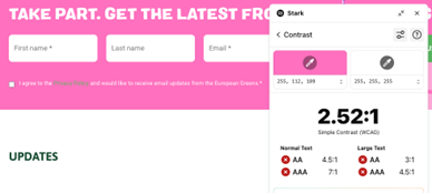
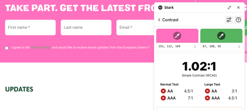
White text on pink background is hard enough for readability, but the light green colour indicating link on pink background may be one of the worst contrasts we have ever measured.